13 Interactive & Engaging App Walkthrough Examples


.avif)
Imagine downloading a new app, excited to try the features, and see how it can make your life easier. But when you open it, you’re met with a confusing array of buttons and a complicated layout. The app seems to offer great functionality, but it quickly becomes overwhelming without a solid intro to guide you through the basics. You close the app in frustration, and, likely, you’ll never return to it. This scenario is all too common for users today, and it’s why app walkthroughs are so important. App walkthrough examples, like product demo videos for apps, help new users get acquainted with an app’s features so they can start using it immediately. This article will explore app walkthroughs in more detail and provide inspiring examples to help you create your own.
Moonb's product demo video service can help you create your app walkthrough quickly. With our help, you can capture your audience's attention and guide them through your app's features with a visually appealing video that breaks down complex processes and excites users to use your product.
What Is An App Walkthrough?
.avif)
An app walkthrough is a guided flow that helps users navigate an app through key features. The goal of an app walkthrough is to help users learn how to use certain features to reach their goals and get value from your product. When a user finishes a walkthrough, they will have experienced your product first-hand, viscerally.
This means they have been activated, making them significantly less likely to churn. Given how much activation correlates with retaining users for a long period, activation should be the goal of your app’s walkthrough.
A Hands-On Approach to Learning
An example of an app walkthrough might be the interactive guides that appear when you open a software program for the first time. Instead of just showing you how to use the features with static images or videos, these guides help you get started by walking you through the process of using the features to achieve your goals.
Walkthroughs vs. Product Tours
Interactive walkthroughs and product tours are similar, but they aren’t quite the same. They both guide end-users through processes to increase efficiency but have different functions and end goals.
Interactive walkthroughs teach users how to interact with the critical elements of your feature or tool. They are typically more hands-on than other types of tutorials, as they often involve the user completing tasks or making choices as they progress through the walkthrough.
Accelerating Product Adoption
To help employees learn how to use a new CRM, an enterprise company might create walkthroughs to train users on using the new tool efficiently. The purpose of these interactive guides is to facilitate faster product adoption of new tools or newly released features.
Guiding Users to Success
SaaS products, mobile apps, and web apps usually use product tours during user onboarding to give users a sense of the environment. Product tour software helps reduce customer time-to-value, drive engagement and retention, and highlight the most valuable features during user onboarding.
Related Reading
13 Interactive & Engaging App Walkthrough Examples

1. Slack: A Smooth Walkthrough for a Complex App

Slack is an instant messaging platform that acts as an alternative to email. The instant nature of the platform means that it’s great for keeping remote teams in touch with each other. As more and more businesses move to remote working, apps that work both on desktops and on smartphones are becoming more of a necessity.
A Personalized Walkthrough Experience
Slack’s mobile app has a fantastic walkthrough! It begins with succinct and engaging screens that explain the app's top features. From there, users can select a team that is most relevant to them and watch an interactive demo play out. For instance, when you select the marketing demo, helpful hotspots guide users through the demonstration. This interactivity helps users better understand how the app works before they start using it.
2. Binance: Simplifying Onboarding for a Highly Technical Space

Binance, a popular cryptocurrency exchange platform, uses app walkthroughs to guide new users and increase activation rates. By simplifying complex features, Binance helps users feel confident in navigating its trading tools.
The App Walkthroughs:
- Simplifies onboarding for new users in a highly technical space.
- It uses interactive walkthroughs to highlight important features, making it easier for users to start trading.
- It helps boost retention by ensuring users understand key functionalities early on.
3. Evernote: Getting Started with Personalized Onboarding

Evernote is known for offering one of the best user onboarding experiences. It starts user onboarding with a four-step survey designed to help you get the most personalized user experience with the app. But that’s not even the good part. After you have completed the survey and are brought to the app, the app walkthrough occurs as you click on the app features, meaning contextually.
Leveraging Empty States for Effective Onboarding
The app tells you about it through tooltips if it's an easy task. You can always click the show me button for the more complicated ones. The app shows you a small video of what you should do with the feature and then leads you to it using hotspots. The Evernote app also uses empty states.
4. Figma: Learning Design Collaboration as You Create

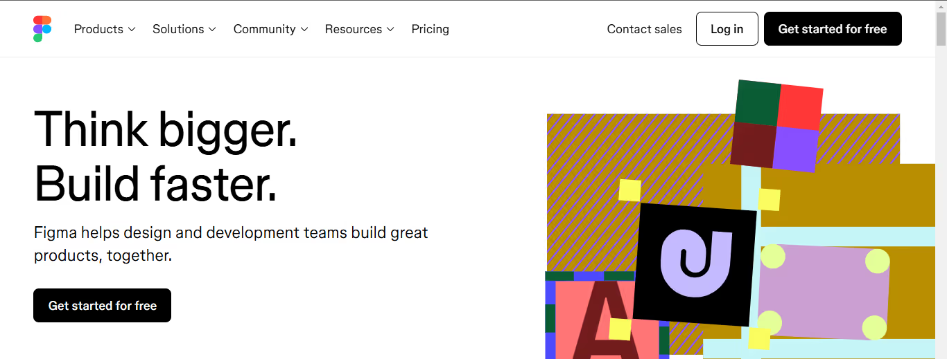
Figma, a design collaboration tool, personalizes the user experience by offering in-editor walkthroughs. The platform ensures new users can easily understand its design tools without leaving the editor.
The app walkthrough:
- Provides in-editor guidance, allowing users to learn as they work.
- Personalizes the experience by adapting the walkthrough based on user actions and roles (designer, collaborator, etc.).
- Helps users quickly get up to speed without feeling overwhelmed by complex features.
5. Humanity: A Highly Prescriptive Walkthrough to Remove the Guesswork

Employee management platform Humanity offers several different features, but the company wisely focused its new user onboarding on its core functionality: scheduling. The highly prescriptive walkthrough uses action-driven tooltips to remove the guesswork and sequentially guide new users through their actions to achieve value.
A Hands-On Approach to Learning
The highly prescriptive, action-driven walkthrough teaches new users how to use Humanity’s core features. It’s a thorough guide to the tool without feeling monotonous because it requires user action. Once the initial app walkthrough is complete, Humanity offers the chance to take a product tour of the rest of Humanity’s features.
That tour is less in-depth and enables Humanity to gradually let go of users’ hands versus dropping them into a complex product before they’re ready.
6. Salesflare: A Simple Walkthrough for a Complicated Tool

Salesflare is CRM enterprise software that automates most of the work of keeping your contacts up to date. CRMs can be complicated, but Salesflare's strength is its simplicity. Their onboarding flow starts by asking new users to take the product walkthrough. Giving users the choice works well, as it means those who prefer to find their way around won’t have to sit through a tour and risk switching off.
From Introduction to Integration
Once users start the tour, they are introduced to some of the key components of Salesflare. As users progress through the app, an interactive walkthrough explains the benefits of Salesflare and shows them how easy it is to use by pushing users to do it themselves. Once users complete the interactive guide, they are prompted to connect different services and web apps.
7. Demio’s Product Tour and Interactive Walkthrough

Demio is a webinar hosting service designed to make sharing your webinars with the world even more accessible. When you first sign in to Demio, you receive a product tour. Then, there is a webinar set up for you to join. When you enter the room, a Demio employee explains via a video that this is an example of the kind of webinar you can host.
After a brief introduction, she hands the reins over to you. You are now in charge of this fake webinar. You can share your webcam or even use the slides Demio has added. Demio’s “aha!” moment is realizing just how simple it is to host a webinar with them. By letting you experience and try the product with an interactive walkthrough, Demio ensures you’re ready to activate.
Demio is an excellent example of using walkthroughs and a product tour to create something entirely different from traditional training methods.
8. Trello’s Interactive Walkthrough

Trello is a task management app that lets you organize your tasks and collaborate with other team members. With its app walkthrough, Trello guides new users through setting up their first board so they can get started right away. When users sign up, Trello asks them to name their first board.
A Hands-On Introduction to Trello’s Core Structure
Next, it explains how Trello boards are structured in Lists. But of course, it doesn’t simply tell users; it empowers them to create some of their own. It then explains the concept of Cards and how they form the Lists, encouraging users to make some and driving feature adoption. At this point, new users understand the hierarchy of a Trello board. They now know how it works. Not only that, but they have also been working to create their first board.
After they’re asked to invite some team members, Trello takes users to the Trello board they just created.
9. Asana’s Product Walkthrough Helps Users Create Their Own Project

Project management tool Asana helps teams organize, track, and manage their workload. Similarly to Trello, Asana’s product walkthrough shows new users how to create their first tasks. Then, it lets you choose from different visualization options, reassuring you that you can change this later.
A Smooth Onboarding Experience
The product walkthrough ends with the option to invite teammates and download Asana for all your screens. This easy-to-follow interactive walkthrough is practical because it nudges the user to use key features without overloading them.
10. Product Hunt: A Simple Walkthrough for a Complex Tool

Product Hunt, a platform for discovering new products, uses onboarding tooltips to engage and activate users. Its walkthrough ensures users can navigate the platform and use its core features effectively.
The tooltips appear at key moments, guiding users to interact with essential platform sections. It focuses on activating new users by providing simple, helpful information right when it’s needed. It enhances user engagement by making the discovery process more intuitive.
11. Pinterest: Getting Started with a Personalized Feed

Pinterest is a visual social media platform that lets users save, share, and search for images from the Internet. During signup, new users are asked to select five or more interests, resulting in a personalized feed immediately. A brief walkthrough and user onboarding checklist help them start from there.
Streamlined Onboarding
Pinterest designed the core action around simplicity: just save an image to a board. After customizing your feed during onboarding, only three clicks are required to save an image to create your first board. If users need more ideas of what to do next, a simple checklist makes it straightforward for new users to know their priorities. We’re a sucker for a good checklist.
12. Honey: Getting Users Comfortable with a Simple Process

Honey is a coupon site that automatically applies online coupons for users when they shop on eCommerce websites. Users can add the Chrome extension to their browser in just a few clicks. From there, they can watch snappy GIFs demonstrating exactly how Honey works.
A Guided Tour to Coupon Savings
Users can click through the steps in their own time to learn at their own pace. However, while this is excellent onboarding, it’s not what we’d class as a walkthrough. Honey goes further to walk users through using the extension to find coupons. This click-through demonstration is engaging and lets new users get a feel for how they might use Honey when shopping online.
A Gentle Push Towards Savings
Honey also automatically appears the first time new users visit an eCommerce site's checkout page after adding the Chrome extension. Clear and concise pop-up boxes show users exactly how to apply coupons and save money. Alternatively, they can click the ‘Try Later’ text beneath the ‘Apply & Coupons’ button if they don’t feel like using Honey.
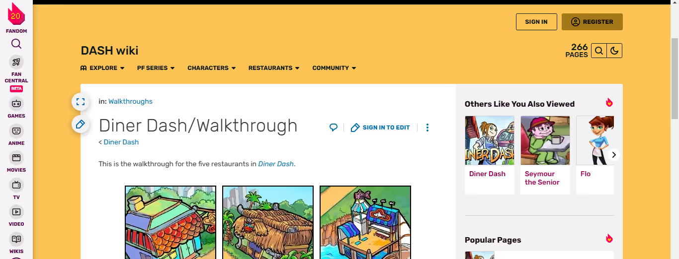
13. Diner Dash: A Comprehensive Walkthrough for a Mobile Game

Just like fitness, mobile gaming is a competitive industry. In 2021, the App Store had almost 4 million apps, and nearly one million were games! Diner Dash Adventures is a viral mobile game with a score of 4.4/5 stars from over 70,000 reviews (on the App Store). The game also won Google Play’s ‘Best of 2019’ award.
A Comprehensive Guide to Diner Dash Adventures
The Diner Dash Adventures walkthrough is comprehensive and engaging – exactly what’s needed to get new downloaders excited about a game. It combines text pop-ups and highlighted hotspots to guide users through a simplified version of a level. When the level is complete a celebratory screen congratulates users for a job well done – encouraging further engagement.
Balancing Guidance and Exploration
As users progress throughout the game, the highlighted hotspots and text pop-ups are reduced but still appear whenever there is something new to review. This ensures that users know exactly what every part of the game does to maximize its enjoyment.
Related Reading
- App Demo Video
- How to Educate Customers About Your Product
- Product Demos Experience
- How to Make a Product Demo Video
- Software Demo Script Examples
- SaaS Demo Best Practices
Benefits of Having a Good App Walkthrough

App walkthroughs provide a seamless onboarding experience for new users, making it easier for them to understand and use the app effectively. By guiding users through important features and steps, walkthroughs help:
- Reduce confusion
- Improve satisfaction
- Encourage long-term usage
Personalized Onboarding
Surprise your first-time app users by establishing a personalized and seamless onboarding flow. Engage in real-time and make users discover the app by quickly instructing them on:
- Registration process
- Login options
- First-time promo codes
Implementing real-time notifications can enhance the onboarding experience.
Help Users Discover App Features with App Walkthroughs
Convert app users into power users with contextual walkthroughs to instantly familiarize users with the app and its features. Send contextual in-app messages highlighting a new or existing low-adaption app feature to the users.
Contextual Onboarding and Timely Tips
This will reduce app nesia and increase repeat app usage. Use contextual walkthroughs to display tips through instructional overlays and coach marks—guide action-driven users to learn the app swiftly on the go. Push notification tools can help deliver these tips effectively.
Customize User Journey And Direct Users Towards Conversion
Around 80-90% of all mobile apps launched in app stores are abandoned after one use. And an average mobile app loses around 77% of daily active users within just three days of installation. With any software, there will always be some level of user churn – but churn rates don’t have to be so high.
The Key to User Retention
One way to reduce user churn is to equip your users with the knowledge to get the most out of your website or app. From the moment a user installs an app, their app journey commences. This is your opportunity to make them realize the value of your app by seamlessly customizing their experience.
A Personalized Approach to User Engagement
Map the user journey, spot its discrete stages, and customize the app tour to meet each user’s motivation and expectations. Doing this will keep them sustainably engaged for a longer period. Target passive users by developing tailor-made walkthroughs across multiple app screens.
Save these context observations for future users who meet your qualification parameters. Implementing web app push notifications can further engage passive users.
Capture Real-time User Feedback to Detect Loopholes
For any business, customer feedback is crucial as it helps you detect even the smallest loophole in your app. It’s an opportunity to improve the user interface effectively. Go beyond the blanket feedback ideas of review and rating by taking live feedback from in-app users through qualitative surveys.
Leveraging Feedback and Notifications for Continuous Improvement
Use the feedback received to improve your UI or product/service offering. Implementing all these strategies can help you build a successful app onboarding experience quickly. Using the best push notification platform can also help you collect feedback and provide valuable updates to users.
Moonb's All-in-One Solution
Moonb is a video marketing agency offering unlimited video editing subscriptions designed to elevate your content. Key features include:
- Project Management Integration: Seamless collaboration through Trello, Slack, and MS Teams
- Weekly Strategy Calls: Regular check-ins to align with your goals
- Contract-Free, Full-Service Production: A flexible approach without long-term commitments
A Superior Video Solution
Moonb stands out as a superior alternative to traditional video agencies, freelancers, and in-house production teams, thanks to:
- A flexible, subscription-based model
- Expertise in creating compelling video content
We’re the ideal partner for companies aiming to enhance their marketing and educational efforts through powerful video content.
Start a 3-day free trial with our product demo video service to take your content to the next level.
6 Best Tips For Creating An App Walkthrough
.jpeg)
1. Make a Great First Impression with a Welcome Screen
The first step in any app walkthrough is to create a welcoming environment with a friendly welcome screen. Think of this as your app’s first handshake. A welcome screen sets the tone for the user’s journey. It’s not just about looking good; it’s about making users feel good.
Personalizing the First Impression
Personalizing the welcome by using their name (gathered during sign-up) or adding a friendly team photo can make users feel like the app is built just for them. This screen also serves as a chance to reintroduce your app’s value proposition in one short, snappy sentence. Done right, it’s like saying, “Hey, we’re here for you, and here’s why you’re going to love using us.”
2. Get Personal: Segment Your Users
People prefer to avoid generic instructions, and segmentation helps you avoid that. By using a micro-survey early in the walkthrough, you can pinpoint who your users is and what they need. Whether a project manager or an accountant, their experience should feel tailored.
For example, if you know the user is managing multiple social media accounts, guide them to features for handling client approvals rather than showing irrelevant tools. It’s like asking them, “What do you need?” and designing a personal roadmap.
3. Focus on Activation
This is where the walkthrough magic happens—showing users the core value of your app in a way that sticks. Think of activation as that “aha moment” when users realize your app is a game-changer. Whether it’s demonstrating how to create their first post or showing them how to set up a project, the goal is to deliver an immediate win.
Analytics can also help here. It tracks what successful users are doing and builds your walkthrough around those actions.
4. Use Checklists for Activation Steps
Checklists are like breadcrumbs leading users to success. A simple, clear list with 2-3 steps ensures that users know what to do without feeling overwhelmed. Tools like Postfity’s checklist, which guides users to connect accounts and schedule posts, are great examples. Plus, checklists tap into the Zeigarnik effect—unfinished tasks stick in our minds. By showing progress (e.g., “You’ve already completed step 1!”), you motivate users to keep going.
5. Build Interactive Experience Flows
Here’s where your walkthrough comes to life:
- Interactive flows
- Like tooltips
- Hotspots
- Demo content
- Guide users step-by-step
Using Hotspots, Tooltips, and Demo Content
Think of it as holding their hand through complex actions without being overbearing. Hotspots are particularly helpful for drawing attention to must-click features, while tooltips provide quick explanations. And demo content? It shows users what their dashboard could look like when fully set up, making your app feel actionable.
6. Keep the Visuals Subtle But Effective
Subtle animations like slideouts and hotspots can highlight features without overwhelming the user. Slideouts, for instance, gently nudge users toward actions, while hotspots make important buttons pop. The key is balance—draw attention without confusion. Less is more here; too many distractions can derail the experience.
Related Reading
Start a 3-day Free Trial to Take Your Content to the Next Level with Our Product Demo Video Service
Moonb is a video marketing agency offering unlimited video editing subscriptions. With a flexible, subscription-based model, we take the stress out of video production so you can focus on creating compelling content. Instead of relying on traditional video agencies, freelancers, or in-house production teams, partner with Moonb for a full-service approach that seamlessly integrates with your existing project management systems like Trello and Slack.
Our team will work with you to create a custom product demo video that elevates your marketing and educational initiatives. Start a 3-day free trial today to see for yourself.


